THEME
Making an image that belongs on this page
Every slot below has its own framing note. This section is the part that is the same everywhere — the tonal and colour discipline that decides whether a new photograph looks like it was made for this page or dropped onto it.
| Rule | What it means when you shoot and finish | ||
|---|---|---|---|
| Grounds | The page runs on four grounds: charcoal #3B3B3C,
near-black #231F20, white, and band grey #BCBEC0. A photograph is always
on one of the two dark ones. Match your shadows to charcoal rather than to pure black — a
crushed-black image sits inside the ground and loses its edge. | ||
| Tonal range | Every photographic slot is inked by a gradient somewhere between 25% and 95% charcoal. An image with detail only in the mid-tones goes muddy under that. Give us a wide range: real blacks, a few clean highlights, and separation between the subject and what is behind it. | ||
| The copy zone | Each slot names where the live text sits. Keep that zone in the lower half of its tonal range — no windows, lit shelves, white walls or sky behind the words. Text over these is verified by sampling the actual pixels behind every character, and a bright patch there forces us to deepen the scrim, which flattens the whole picture. This has cost real quality on three slots so far. | ||
| Colour temperature | Warm light — domestic lamplight, dusk, retail interiors — sits with the charcoal. Cool blue daylight fights it and reads as a stock photograph. On the white chapters the opposite holds: neutral daylight, no warm cast. | ||
| Red | The only saturated red on the page is Livguard’s
#ED1C24, and it is reserved for accents — rules, ticks, the play button, the bolt.
Livguard’s own product livery in shot is the brand and is welcome. An unrelated red — a
sofa, a car, a rival’s packaging — competes with it and will be asked for again. | ||
| Finish neutral | No baked vignette, no film grain, no strong LUT, no drop shadow, no rounded corners. The page applies its own gradients, its own bolt field at 10–12% and its own corner radius; a photograph that already has those composites twice and looks dirty. | ||
| Nothing baked in | No text, logos, lockups, badges, warranty shields or claim strips. Every headline, label, figure and button on the page is live HTML. This is the single most common reason a supplied banner cannot be used: the existing livguard.com creatives have their copy burned in, so they only work here in tight crops that dodge it, or after the copy is patched out by hand. | ||
| Two crops, one subject | Landscape and portrait per slot, with the subject in the same relative place in both. A portrait crop that re-composes the scene makes the two breakpoints look like two different pages. | ||
| Centre-safe | Everything is placed with cover and
centred; the page carries no per-image offsets. If an asset only works with a bespoke
background-position, it is the wrong crop. | ||
| People | Real Indian homes, roofs and shops. Faces and hands unobstructed, no posed stock gestures, no thumbs-up. Where the ambassador is already composited into a supplied creative, that creative cannot also share a frame with the cut-out — you get two of him. | ||
| Files | WebP, sRGB, quality 80–85; near-lossless WebP or PNG-24 where alpha is needed. Send the un-cropped master too — slots move, and a master lets us re-crop without going back to you. | ||
- The quickest test: squint at the image at 20% size. If the subject still separates from its background and the area under the copy zone is the darkest part of the frame, it will work here.
- Deliverables that have been rejected on this project, and why, so the same round is not repeated: artwork with the headline burned in; a hero-shaped creative cropped into a contained plate; a watermarked stock frame; an expired-offer banner; a portrait file for a landscape slot.
Slots for
The homepage
Eleven slots across /final-b, the finalised build, and /final. Both share every photographic ground; only slide 01 of the hero differs between them.
HERO-02 · 03 · 04× 3
Hero carousel — photographic slides
Three full-bleed photographs behind the rotating hero. Slide 01 is a built composite, specified separately below.
| Build | Dimensions | Shape | Max weight |
|---|---|---|---|
| Desktop / tablet | 2400 × 1350 | 16:9 | 250 KB |
| Mobile | 1080 × 2340 | 9:19.5 | 280 KB |
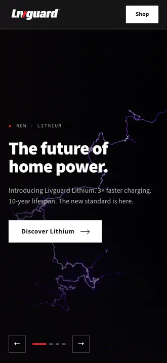
What you deliverthe photograph only — no text, no gradient, no logo. The shots below are placeholders, shown for framing
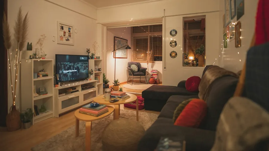
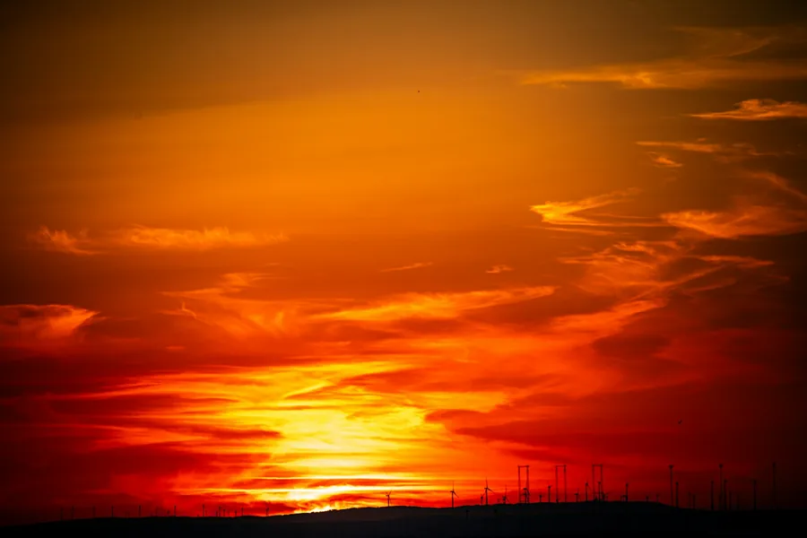
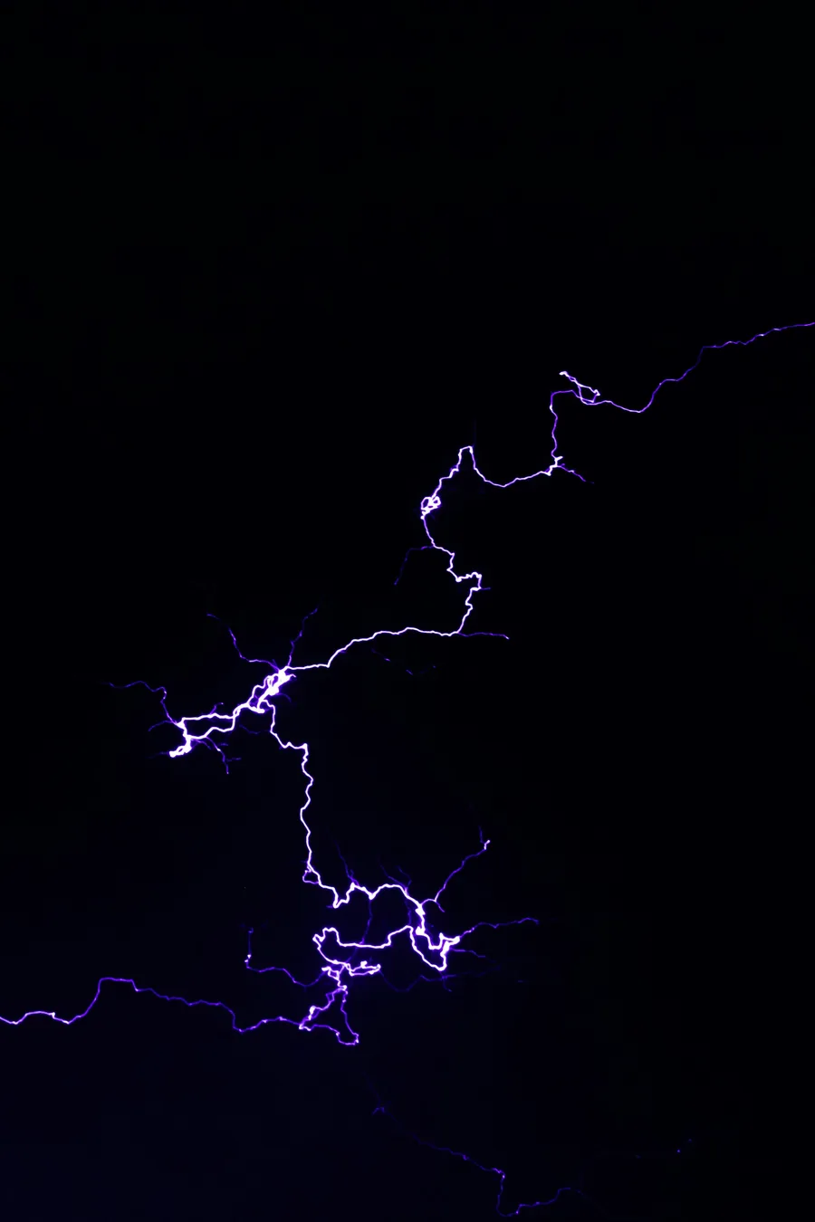
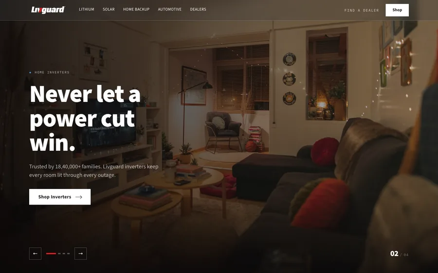
How it is usedevery word and button here is live HTML, added in code; the photography is placeholder
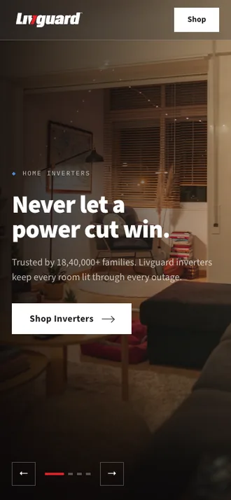
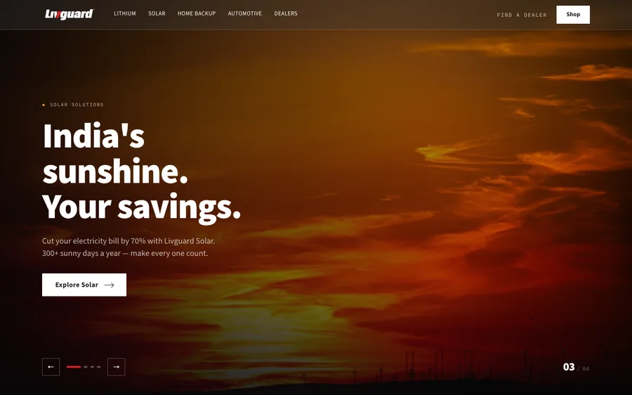
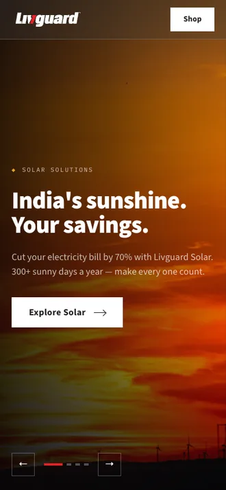
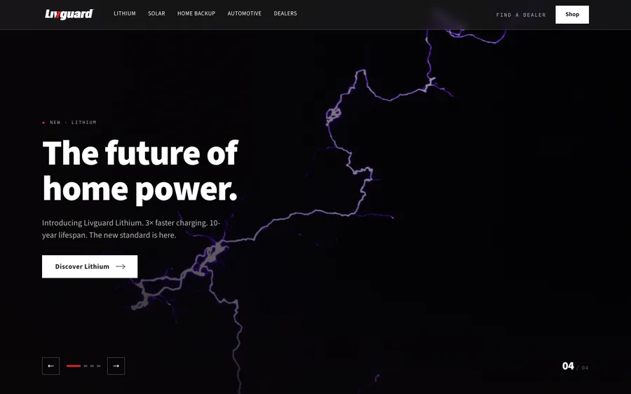
Safe areaslive copy sits hereput the subject here
- Copy sits in the left 18–43% on desktop. Keep the focal subject right of 48%.
- On mobile the copy is anchored to the FOOT of the frame, not centred — this changed in the 2 September build. So the subject belongs in the upper 55–65% of the portrait crop, and the bottom third wants to be quiet and dark: it is where the headline, sub-line and button land.
- The portrait crop is placed at 125–132% height and anchored bottom, so the TOP of the plate is what gets cropped away, not the sides. Do not put anything you need in the top 20% of the portrait file.
- Give the portrait crop a dark floor — a shadowed surface, a dark shelf, a night sky. Where a plate ran bright all the way down we had to deepen the ramp over it, which flattens the photograph.
- Renders at 100% of the viewport, so the frame swings from 16:9 landscape to roughly 1:2.2 portrait. This is why two crops are needed, not one resized file.
HERO-01-AMB
Ambassador cut-out — hero slide 01
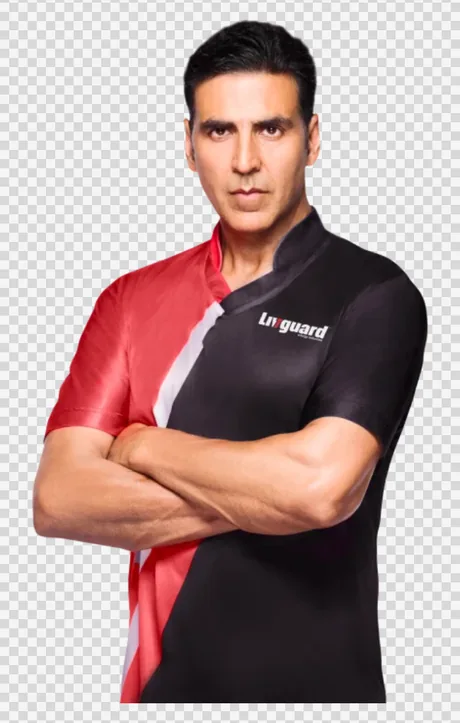
Akshay Kumar knocked out on transparency, composited over an ink field with the power bolt behind him.
| Build | Dimensions | Shape | Max weight |
|---|---|---|---|
| Desktop / tablet | 1200 × 2100 | transparent | 180 KB |
| Mobile | same asset | — | — |
What you delivercut-out on transparency — the checkerboard is what must be empty
How to frame itshoot to this and no repositioning is needed in code
- Subject
- Akshay Kumar, full figure, head to below the knee, facing camera.
- Ground
- None — knocked out to transparency. No shadow, no reflection, no vignette.
- Position
- Centred in the frame, feet on the bottom edge, no lateral cropping.
- Placed with
- Anchored bottom and scaled by height. One asset for every breakpoint.
How it is usedevery word and button here is live HTML, added in code; the photography is placeholder
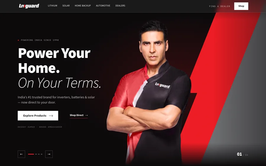
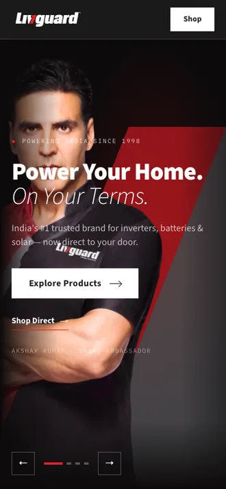
- Applies to /final. On /final-b slide 01 is the client’s own “2 Cr happy customers” banner instead — a flat composite, no cut-out. If a banner is supplied for that slot it must carry no baked copy in its left 46%: that band is inked over and the page sets its own headline there. The one we were sent had its headline burned in, and it had to be patched out against the underlying skyline before it could be used.
- WebP with an alpha channel, or PNG-24. One asset serves every breakpoint.
- Full figure, head to below the knee, anchored to the bottom edge. No lateral cropping, no drop shadow, no baked background.
- At least 1200 × 2100. The figure renders up to 553 × 950 CSS pixels, so anything smaller softens on a large screen.
LITH-BLADE
Lithium X — angled blade
The product shot inside a parallelogram cut at the power bolt’s own 0.4 slope.
| Build | Dimensions | Shape | Max weight |
|---|---|---|---|
| Desktop / tablet | 1400 × 1050 | 4:3 | 160 KB |
| Mobile | 1600 × 680 | landscape | 140 KB |
How to frame itshoot to this and no repositioning is needed in code
- Subject
- The Lithium X unit alone, three-quarter view, filling roughly 70% of the frame height.
- Ground
- Dark seamless studio ground — charcoal or near-black. No gradient graphics, no chevrons.
- Position
- Centre the unit, then leave the left 34% and the bottom-right corner empty.
- Placed with
- cover + centre. Nothing else — no per-image offsets.
How it is usedevery word and button here is live HTML, added in code; the photography is placeholder
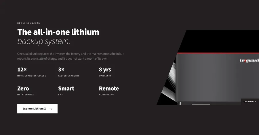
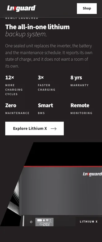
Safe areaslive copy sits hereput the subject here
- Deliver a plain rectangle. The diagonal is applied in code, not part of the artwork.
- The cut removes the left ~32% at the top. Keep the product clear of it, and clear of the bottom-right ~130 × 40 px where the LITHIUM X chip sits.
- The slot that most needs a purpose-shot asset: the frame is small and angled, so the detail has to be there to begin with.
SOLAR-BG
Solar 360 — full-bleed ground
A rooftop array behind the Solar 360 chapter, under a top-to-bottom dark ramp.
| Build | Dimensions | Shape | Max weight |
|---|---|---|---|
| Desktop / tablet | 2400 × 1150 | ~2.1:1 | 280 KB |
| Mobile | 1080 × 2400 | portrait | 300 KB |
How to frame itshoot to this and no repositioning is needed in code
- Subject
- A rooftop array, wide. No people, no product cluster, no lockup.
- Horizon
- In the upper third, so the sky sits inside the lightly-scrimmed top band.
- Position
- Interest centred left-to-right, so the same file reads at both crops.
- Placed with
- cover + centre at both breakpoints.
How it is usedevery word and button here is live HTML, added in code; the photography is placeholder
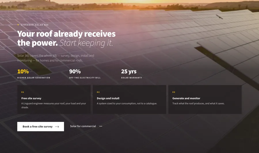
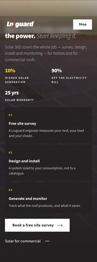
Safe areaslive copy sits hereput the subject here
- The scrim only reaches 10–24% opacity across the top fifth, so that band shows at near-full brightness. Keep it clean — sky or open panels, no clutter.
- The tallest slot on the page: 1054 px tall in a 390 px-wide phone frame, roughly 1:2.7. Deliver portrait for mobile and keep the subject centred — the sides get cropped.
DEALER-BG
“We are everywhere” — dealer and service ground
The dealer-shop creative behind the merged dealer and service chapter. Replaced the night-interior brief in the 2 September build, when the service network was folded into this one dark section.
| Build | Dimensions | Shape | Max weight |
|---|---|---|---|
| Desktop / tablet | 2400 × 1100 | ~2.2:1 | 260 KB |
| Mobile | 1080 × 1900 | portrait | 240 KB |
How to frame itshoot to this and no repositioning is needed in code
- Subject
- A Livguard dealer at their counter, or the shop interior — a real retail context, not a studio set.
- Position
- The person and the product wall sit CENTRE-RIGHT. The left 46% is the copy column and is inked over.
- Depth
- Some foreground and some background; a flat wall gives the scrim nothing to sit on.
- Placed with
- cover + centre, plus a dedicated portrait cut for phones.
Safe areaslive copy sits hereput the subject here
- This chapter carries the most copy of any photographic section — headline, sub-line, a three-figure stat row and two buttons. Two gradients ink it: a left-to-right fade that dies out by 60% of the width, and a radial anchored bottom-left for the stat row. Keep the bottom-left quadrant free of anything you need seen.
- No baked wall signage in the upper right. The creative we were sent had a floating Livguard lockup on the back wall; it read as page furniture rather than as part of the shop, and was painted out. Branding that is genuinely part of the scene — on the shelf boxes, on a poster, on the counter — is exactly right.
- Warm retail or domestic light works with the charcoal ground; cool blue daylight fights it.
- The phone cut is a real portrait composition, not a centre crop of the landscape one: on a phone the copy occupies everything below the top fifth, so the subject has to be high in the frame.
CLOSE-BG
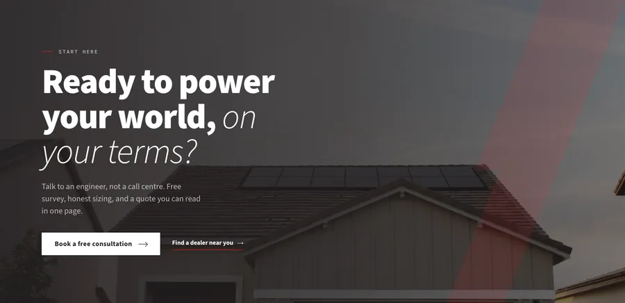
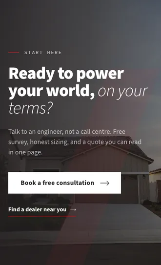
“Ready to power your world” — ground
A rooftop or installation scene behind the closing call to action.
| Build | Dimensions | Shape | Max weight |
|---|---|---|---|
| Desktop / tablet | 2400 × 1050 | ~2.3:1 | 260 KB |
| Mobile | 1080 × 1800 | portrait | 240 KB |
How to frame itshoot to this and no repositioning is needed in code
- Subject
- A rooftop or installation in progress — an outcome, not a product shot.
- Position
- Interest right of centre, as above.
- Light
- Late-afternoon or dusk; it follows a white section and should feel like a close.
- Placed with
- cover + centre.
How it is usedevery word and button here is live HTML, added in code; the photography is placeholder
Safe areaslive copy sits hereput the subject here
- Same scrim logic as DEALER-BG: interest right of 55%.
- This is the last thing on the page before the footer — it should feel like an outcome, not a product shot.
REACH-MAP
Coverage map — retired
Kept on this sheet only so the brief is on record. The “within reach” chapter it belonged to no longer exists as a separate section.
| Build | Dimensions | Shape | Max weight |
|---|---|---|---|
| Desktop / tablet | 1600 × 1100 | 16:11 | 120 KB |
| Mobile | same asset | — | — |
How to frame itshoot to this and no repositioning is needed in code
- Status
- Retired 2 September 2026. The chapter it sat in was merged into DEALER-BG, so there is no coverage-map slot on the homepage any more.
- If it comes back
- Landscape 16:11, contained — not cropped. India outline with the dealer network.
- Reads
- Greyscale with a slight contrast lift, so it must work without colour — differentiate by line weight, not hue.
- A hero-shaped service creative was tried in this slot and rejected: artwork composed for a full-bleed hero does not survive being cropped into a contained 16:11 plate. If a coverage or service visual is wanted on the homepage again, it has to be composed to the slot rather than adapted to it.
PRESS-PLATE× 5
Press cuttings — headline plates
One 5:2 plate per press item on the rail, framed by a hairline. The plate IS the headline — our own copy of it is kept for the link name and hidden.
| Build | Dimensions | Shape | Max weight |
|---|---|---|---|
| Desktop / tablet | 1100 × 370 | ~3:1 | 90 KB |
| Mobile | same asset | — | — |
How to frame itshoot to this and no repositioning is needed in code
- Subject
- The headline of the published article, in the publisher’s own typeface, on their own paper colour.
- Crop
- The headline block only — no navigation, no share buttons, no body column. A column of body type is illegible at this size and carries nothing.
- Ground
- Whatever the publisher’s page uses. Do not re-set the headline in our type.
- Screenshot at 2× and downscale, or the serif headlines fringe.
- These run in full colour at rest. An earlier build desaturated them until hover; the stakeholder asked for colour, so whatever tint the publisher’s page has is what shows.
PRESS-MAST× 5
Press mastheads
The five publication marks beside each cutting.
| Build | Dimensions | Shape | Max weight |
|---|---|---|---|
| Desktop / tablet | height 160, width to suit | alpha | 110 KB |
| Mobile | same asset | — | — |
How to frame itshoot to this and no repositioning is needed in code
- Subject
- The publication masthead alone.
- Ground
- Transparent. Key it off the publisher’s white, do not deliver it on a white rectangle.
- Colour
- The masthead’s real colours — ET, NBT, TOI and India Blooms all carry red; The Hindu is genuinely black.
- Deliver at 160 px tall with an alpha channel; the page scales each one down to a per-publisher optical height.
- Send the single-line lockup where the publisher has one. The older two-line NBT lockup needed its own height override to stop it towering over the row.
- Do not recolour or re-draw a masthead to fit the palette — it is someone else’s trademark. If only a monochrome version exists, that is what we use.
VIDEO-POSTER× 4
Testimonial video posters
The still that stands in for each customer video. The player itself is only fetched when someone presses it, so this poster is all the page ships at rest.
| Build | Dimensions | Shape | Max weight |
|---|---|---|---|
| Desktop / tablet | 640 × 800 | 4:5 | 30 KB |
| Mobile | same asset | — | — |
How to frame itshoot to this and no repositioning is needed in code
- Subject
- The customer, filmed vertically on a phone — these are real clips, not staged pieces.
- Crop
- Portrait 4:5, face in the upper half.
- Frame choice
- A frame where the person is looking at camera and lit; not a mid-blink or mid-word frame.
- It renders 86 px wide beside the quote, so it must read at thumbnail size: one face, filling the frame, no wide shots.
- Where a testimonial is audio-only, the page labels it “Audio only” over the poster — send a dark card rather than a misleading still.
MENU-CARD× 4
Mega-menu cards
The promoted image in each navigation panel.
| Build | Dimensions | Shape | Max weight |
|---|---|---|---|
| Desktop / tablet | 572 × 264 | ~2.17:1 | 40 KB |
| Mobile | not shown | — | — |
How to frame itshoot to this and no repositioning is needed in code
- Subject
- One product or product group per card.
- Ground
- Dark, or the product’s own scene. These sit on a near-black panel.
- Position
- Centre-safe — the card is cropped with cover and is much wider than it is tall.
- Deliver at 2× — it renders 286 × 132.
- It sits under a heading and a line of description inside the panel, so no baked type of any kind.
- Only shown on the desktop navigation; the phone drawer is text only.
- Applies to ALL THREE pages — /final-b, /lithium and /solar carry the same navigation, so one set of four cards serves the set.
Slots for
The Lithium X One page
Four slots. The whole page currently runs on two photographs — one interior shot is doing all three rating cards and the pause chapter as well. That is what these four slots are here to fix.
Open /lithiumLITH-HERO-BG
Lithium hero — full-bleed ground
The photograph behind the Lithium X One hero. The only slot on either page where the copy column runs right, because the product sits left of frame and a left-hand column buried it under its own scrim.
| Build | Dimensions | Shape | Max weight |
|---|---|---|---|
| Desktop / tablet | 2400 × 1350 | 16:9 | 250 KB |
| Mobile | 1080 × 2000 | portrait | 240 KB |
How to frame itshoot to this and no repositioning is needed in code
- Subject
- The Lithium X One in a room it would really live in, with a person — the product reads as furniture, not as a studio object.
- Position
- Product LEFT, person centre-right. The copy column on this page runs RIGHT, which is the opposite of every homepage slot.
- Floor
- The right 54% stays dark all the way to the foot of the frame — the comparison table sits down there, not just the headline.
- Placed with
- cover, at 34% 50% on desktop and 38% 44% below 860px.
- Two crops, not one resized file. On a phone this hero is roughly 1:2, so a landscape frame loses its sides and the composition stops working. The mockup fakes it with one landscape stand-in at two background positions — the phone view there is an approximation, and this is the slot that most needs a real portrait cut.
- The scrim runs right-to-left: 95% at the right edge, 90% at 38%, 60% at 66%, 24% at the left. So the product on the left is the part that shows, and it has to carry the frame on its own.
- The right 54% carries a headline, a sub-line, a red button AND a three-row comparison table, which reaches much further down the frame than a homepage hero does. Keep that whole column quiet — no lit window, no lamp, no white wall behind the lower half.
- The same file is reused as the Lithium card in the mega menu, cropped to 2.17:1. A frame that survives both is ideal; if not, send the menu crop separately (see MENU-CARD).
LITH-CARD× 3
Rating cards — one photograph each
The image at the top of each of the three rating cards: 100Ah 12.8V, 150Ah 12.8V and 100Ah 25.6V.
| Build | Dimensions | Shape | Max weight |
|---|---|---|---|
| Desktop / tablet | 1144 × 858 | 4:3 | 120 KB |
| Mobile | same asset | — | — |
How to frame itshoot to this and no repositioning is needed in code
- Subject
- One battery per card — three different shots, not one shot at three offsets.
- Scale
- The unit filling roughly 70% of the frame, three-quarter view.
- Ground
- The product where it lives, or a dark seamless studio ground. These sit on a white chapter, so the card itself is the dark element.
- Placed with
- cover + centre. No per-card offsets.
- Three separate shots is the whole ask of this slot. The mockup stands one placeholder in all three cards at three different background positions, so it reads as three views of one room — which is exactly what the finals should not do.
- Renders up to about 430 × 322 in a 1360 container, so 1144 × 858 is 2× and no more is needed.
- Two things sit on top of the image and need clear space: the index numeral (01 / 02 / 03) top-right, and a caption strip along the bottom carrying the rating and its stock status. The bottom 44% and the top 34% each run under their own scrim, so detail there is lost either way.
- If the three ratings are physically near-identical, differentiate by context rather than by product angle — a different room, a different wall, a different shelf.
LITH-PAUSE-BG
“The best battery is the one you forget you own” — ground
The photograph behind the pause chapter, the one section on the page with no CTA and no figures.
| Build | Dimensions | Shape | Max weight |
|---|---|---|---|
| Desktop / tablet | 2400 × 1100 | ~2.2:1 | 240 KB |
| Mobile | 1080 × 1800 | portrait | 220 KB |
How to frame itshoot to this and no repositioning is needed in code
- Subject
- The unit in a lived-in room, quiet. No people, no hands, no action.
- Position
- Interest RIGHT of 55%. The copy column takes the left 54%.
- Light
- Domestic and warm, evening rather than midday — this chapter is the page pausing.
- Placed with
- cover, at 76% 52%.
- On the mockup this is the same placeholder as the three rating cards, its fourth appearance on the page. It needs its own frame in the finals — it is the one chapter here with no product callout and no figures.
- Scrim runs 95% at the left to 56% at the right, so the right third shows at close to full brightness. That is where the subject belongs and it needs to be clean.
- The chapter carries a large headline and one line of prose and nothing else. It is the only place on the page where the photograph is allowed to be the loudest thing, so this is the one worth spending a shoot day on.
LITH-CUTAWAY× 2
Cutaway and cell field — retired
Kept on this sheet so the brief is on record, the way REACH-MAP is for the homepage.
| Build | Dimensions | Shape | Max weight |
|---|---|---|---|
| Desktop / tablet | 1400 × 1050 | 4:3 | 150 KB |
| Mobile | same asset | — | — |
How to frame itshoot to this and no repositioning is needed in code
- Status
- Retired 9 September 2026. Both belonged to the earlier hero, which opened inside the battery on an annotated cutaway. The hero now opens on the room and carries the comparison table, so neither slot exists.
- If they come back
- The cutaway wants to be a real cutaway or exploded view, 4:3, shot square-on with the parts separable — five of them were labelled in code.
- Still owed
- A Lithium creative composed for this page.
- The cell field was only ever usable blurred: the creative carries white campaign type in three places and no crop clears it at every aspect ratio.
- The
.aifile supplied for Lithium turned out to be the service creative’s working file, saved without PDF-compatible content and with its images linked rather than embedded, so nothing could be extracted from it. A Lithium creative composed to this page is still outstanding.
Slots for
The Solar 360 page
Seven slots in five briefs. What is worth knowing before reading them: every stand-in on this page is small — both full-bleed grounds are 1280 × 720 against frames that paint at 2400 px and more, the sticky plate is a square file cropped to 4:5, and the three product shots came off the microsite at display size in three different shapes. So the mockup understates how these frames will look. The sizes below are what the layout actually needs. The page lost two chapters on 10 September — the pause and the testimonials — and the pause chapter’s photograph moved to the close rather than going with it, so that brief is now SOL-CLOSE-BG.
SOL-HERO-BG
Solar hero — full-bleed ground
The photograph behind the Solar 360 hero, under an even four-stop ramp.
| Build | Dimensions | Shape | Max weight |
|---|---|---|---|
| Desktop / tablet | 2400 × 1350 | 16:9 | 250 KB |
| Mobile | 1080 × 2000 | portrait | 240 KB |
How to frame itshoot to this and no repositioning is needed in code
- Subject
- A rooftop array on an Indian building at golden hour — the client’s own creative, not a documentary crop.
- Position
- CENTRED. This is the only hero on the set whose copy is centred, so the quiet band runs down the MIDDLE of the frame, not down one side.
- Foot
- The lower third carries the bill picker and its answer. It has to stay dark and quiet all the way to the bottom edge.
- Placed with
- cover at 50% 62% on desktop, 56% 66% below 860px.
- Size is the thing to get right here. The hero paints full-bleed at up to 2560 CSS px. The stand-in on the mockup is 1280 × 720 and is upscaled about 1.9× to fill it, which is why the hero looks soft there — a placeholder problem, not an artwork one, but it is the reason 2400 px on the long edge is not negotiable.
- Two crops, not one resized file. On a phone this hero is roughly 1:2, so a landscape frame loses its sides entirely. The mockup fakes it with one landscape stand-in at two background positions, so treat the phone view there as an approximation.
- The scrim is an even top-to-bottom ramp — 80% at the top, easing to 62% at a quarter down, back to 88% at the foot. It never drops below 62%, so the whole frame is dark; what matters is that nothing bright sits mid-frame where the headline is.
- Six things stack down the centre: eyebrow-free headline, sub-line, the red button, the label, the four-band tab row and the answer under it. That is a tall column of live type. No windows, no lit signage, no white parapet behind it.
- Interest belongs in the outer thirds and the upper half — that is the part of this photograph that is allowed to be seen.
SOL-ARRAY
Solar 360 — the sticky plate
The photograph beside the five Solar 360 pillars. It sticks at 14vh while the pillars scroll past it, so it is on screen for the whole chapter.
| Build | Dimensions | Shape | Max weight |
|---|---|---|---|
| Desktop / tablet | 1040 × 1300 | 4:5 | 150 KB |
| Mobile | same asset | — | — |
How to frame itshoot to this and no repositioning is needed in code
- Subject
- A clean, newly-installed array seen close up. No people, no lockup, no installer.
- Crop
- PORTRAIT 4:5. This is the one portrait plate on either page.
- Position
- Interest centred; it is placed at 50% 54%, so the top and bottom edges are what get trimmed.
- Placed with
- cover, inside a 4:5 plate.
- Shoot it 4:5. The stand-in is a 1024 × 1024 square being cropped to 4:5, so on the mockup a fifth of the frame is thrown away and there is no headroom at 2× — which is a fair picture of what any square file will do here.
- It renders about 520 × 650 in a 1360 container and it is STICKY, which is unusual for a photograph here: the reader looks at it for the length of five pillars rather than for a second in passing. It earns more detail than a background does.
- The Solar 360 lockup sits directly beneath the plate, not on it. Nothing baked into the image.
- No scrim on this one. It is on a white chapter at full brightness, so exposure and colour are the client’s own — it is the one slot where the photograph is judged as a photograph.
SOL-SYSTEM× 3
The three systems — product shots
The product group at the head of each column of the comparison table: On Grid, Hybrid, Off Grid.
| Build | Dimensions | Shape | Max weight |
|---|---|---|---|
| Desktop / tablet | 900 × 720 | 5:4 | 90 KB |
| Mobile | same asset | — | — |
How to frame itshoot to this and no repositioning is needed in code
- Subject
- One system per file: the inverter with a panel, as a product group. On grid, hybrid and off grid.
- Ground
- Transparent. These sit on a white table cell with no plate behind them.
- Position
- Standing on the BOTTOM edge of the frame — they are placed with object-position: center bottom, so anything floating reads as floating.
- Placed with
- contain, in a 5:4 cell. Nothing is cropped; the whole file shows.
- All three at the same canvas size. The stand-ins are 430 × 370, 397 × 405 and 440 × 468 — pulled off livguardsolar.com at display size — and because they are three different shapes the three products do not share a baseline on the mockup. That is not something CSS can correct: it has to come out of the files.
- Same product scale in all three, as well as the same canvas. The middle column is the recommended system and carries a chip above it, so any mismatch there is the most visible one on the page.
- PNG-24 or WebP with an alpha channel. A white-background file will show its box against the cell.
- The middle column carries a red rule and a “Best for this house” chip above the name. Nothing needs to clear it inside the image, but the artwork should not itself carry a badge.
SOL-CLOSE-BG
“Your roof is ready before you are” — the closing ground
The photograph behind the last chapter, under an ink ramp, with the page’s one power bolt at watermark weight over it.
| Build | Dimensions | Shape | Max weight |
|---|---|---|---|
| Desktop / tablet | 2400 × 1100 | ~2.2:1 | 240 KB |
| Mobile | 1080 × 1800 | portrait | 220 KB |
How to frame itshoot to this and no repositioning is needed in code
- Subject
- A finished installation on a home, and a family under it — this is the one warm, human frame on the page.
- Position
- Interest RIGHT of 58%. The copy and both buttons take the left half.
- Light
- Late afternoon. Warm, low sun — the palette has no warm tone, so this photograph is where the warmth comes from.
- Placed with
- cover at 52% 58%; 62% 40% below 860px.
- 2400 px on the long edge. The chapter is 74vh tall and full-bleed; the stand-in is 1280 × 720, so the mockup shows it upscaled, the same way the hero does.
- It was briefed for the pause chapter, which came off the page on 10 September. The photograph moved to the close rather than going with it — so the frame is the same, but the copy over it is now a headline, one line of prose and TWO buttons, which reach further down the left half than the pause chapter did.
- The ramp runs left to right — 93% at the left edge, 86% at 42%, 58% at the right. The right third shows at close to full brightness and it is the part of the frame anyone actually sees; the family belongs there.
- The power bolt sits over this photograph at 11% as the page’s sign-off, on the right. It is the only bolt on the page, so nothing in the artwork should compete with it: no red graphics, no angular strips, no lens flare.
- A portrait cut is needed: below 860px the ramp is re-aimed top-to-bottom, the copy runs full width and the family has to sit UNDER it rather than beside it.
SOL-LOCKUP
Solar 360 lockup — vector
The Solar 360 mark that sits beneath the sticky plate. Already supplied and in use; this is a re-cut request, not a new asset.
| Build | Dimensions | Shape | Max weight |
|---|---|---|---|
| Desktop / tablet | vector | — | under 20 KB |
| Mobile | same asset | — | — |
How to frame itshoot to this and no repositioning is needed in code
- Deliver
- A true vector SVG — paths only, no embedded raster, no linked images.
- Colour
- Two versions: the light one for dark grounds, and an ink one in case it lands on white.
- Clear space
- Nothing baked around it; the page provides its own spacing.
- This one is not a placeholder — it is the client’s own supplied file, in use as delivered. It is 212 KB, which for a lockup means it is carrying embedded bitmap data rather than paths. It renders at 42–56 px tall, so it ships roughly 200 KB to draw a mark two centimetres high, more than any photograph on the page.
- A path-only re-cut would come in under 20 KB and stay crisp at any size. Nothing else about it needs to change.
ICON-SET× 5
Category icons — “Everything Livguard makes”
Five line marks, one per product category, on white cards. These are drawn rather than photographed because the categories are a taxonomy — equal siblings, not a hierarchy.
| Build | Format | Artboard | Max weight |
|---|---|---|---|
| All breakpoints | SVG | 40 × 40 | 3 KB each |
- SVG only — raster will not work here. They sit on a white card and must stay crisp at any zoom or pixel density.
- Stroke only, no fills. 1.6 px stroke, round caps and joins, on a 40 × 40 artboard.
- Use
currentColorrather than a hard-coded hex, so the colour stays controlled in code. - The five above are shown at production size — match this weight and level of detail.
- Nothing else on any of the three pages needs an icon sent. The Solar page draws its own three marks in the subsidy chapter, and the survey panel its tick list, straight in code at this same weight — they are not an ask and they should not be sourced. If a chapter ever needs one that is not in the five above, it gets drawn to match rather than commissioned.
COPY LIMITS
Text and word limits
Character counts the live layout is built around. Going over won’t break anything, but it pushes headlines onto extra lines and costs vertical space.
| Element | Max characters | Current copy |
|---|---|---|
| Hero eyebrow | 26 | Powering India Since 1998 |
| Hero headline | 32 / 6 words | Power Your Home. On Your Terms. |
| Hero sub-line | 90 / 15 words | India’s #1 trusted brand for inverters, batteries & solar… |
| Section eyebrow | 18 | Livguard Solar 360 |
| Section headline | 56 / 9 words | Your roof already receives the power. Start keeping it. |
| Section body | 160 / 29 words | One sealed unit replaces the inverter, the battery and… |
| Stat figure | 7 | 21,000+ |
| Stat label | 36 | FASTEST-GROWING ENERGY STORAGE BRAND |
| Card title / body | 20 / 48 | Inverter Batteries — The industry’s first 3D grid. |
| Step title / body | 20 / 64 | Design and install — A system sized to your consumption… |
| Button label | 24 | Book a free site survey |
| Lithium hero headline | 38 / 6 words | Still topping up water in your battery? |
| Lithium hero sub-line | 150 / 26 words | Lithium X One drops into the inverter you already own… |
| Rating card body | 76 / 13 words | Best for most single-inverter homes — the direct swap… |
One thing we need from Tanya
For Lithium X and Solar 360, the most useful thing would be:
- The original un-typeset creatives — versions without the lockup or the claim strip burned in.
- Un-cropped masters of any photography, so crops can be re-derived if a section changes rather than re-shot.
- Any existing Solar 360 product and installation photography that has never been typeset — the solar slot is the tallest on the page and the hardest to fill from a landscape banner.